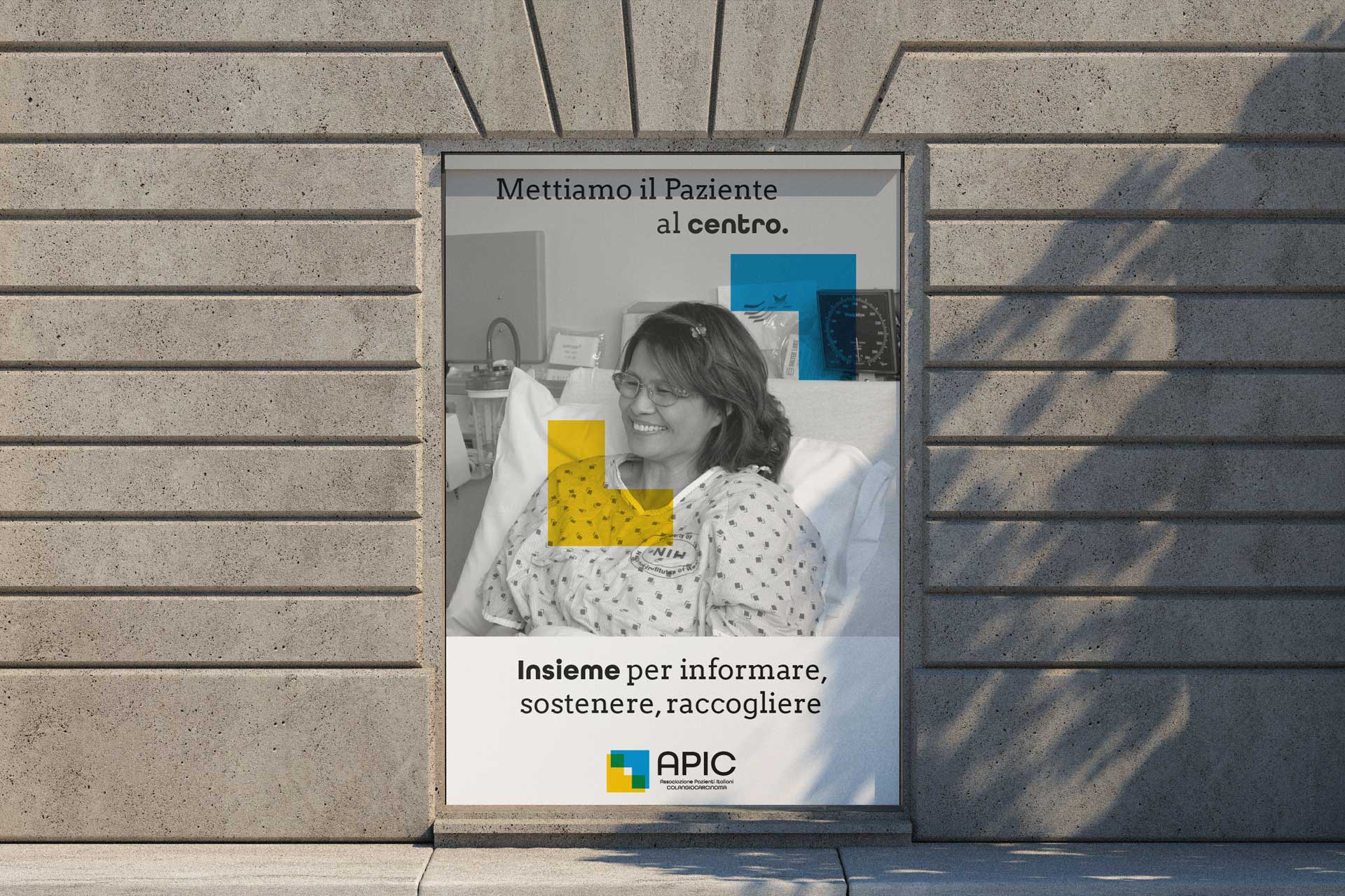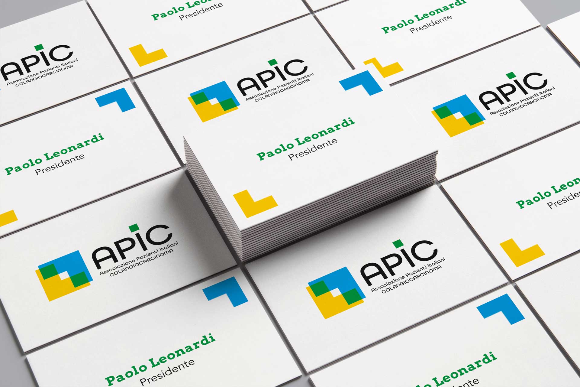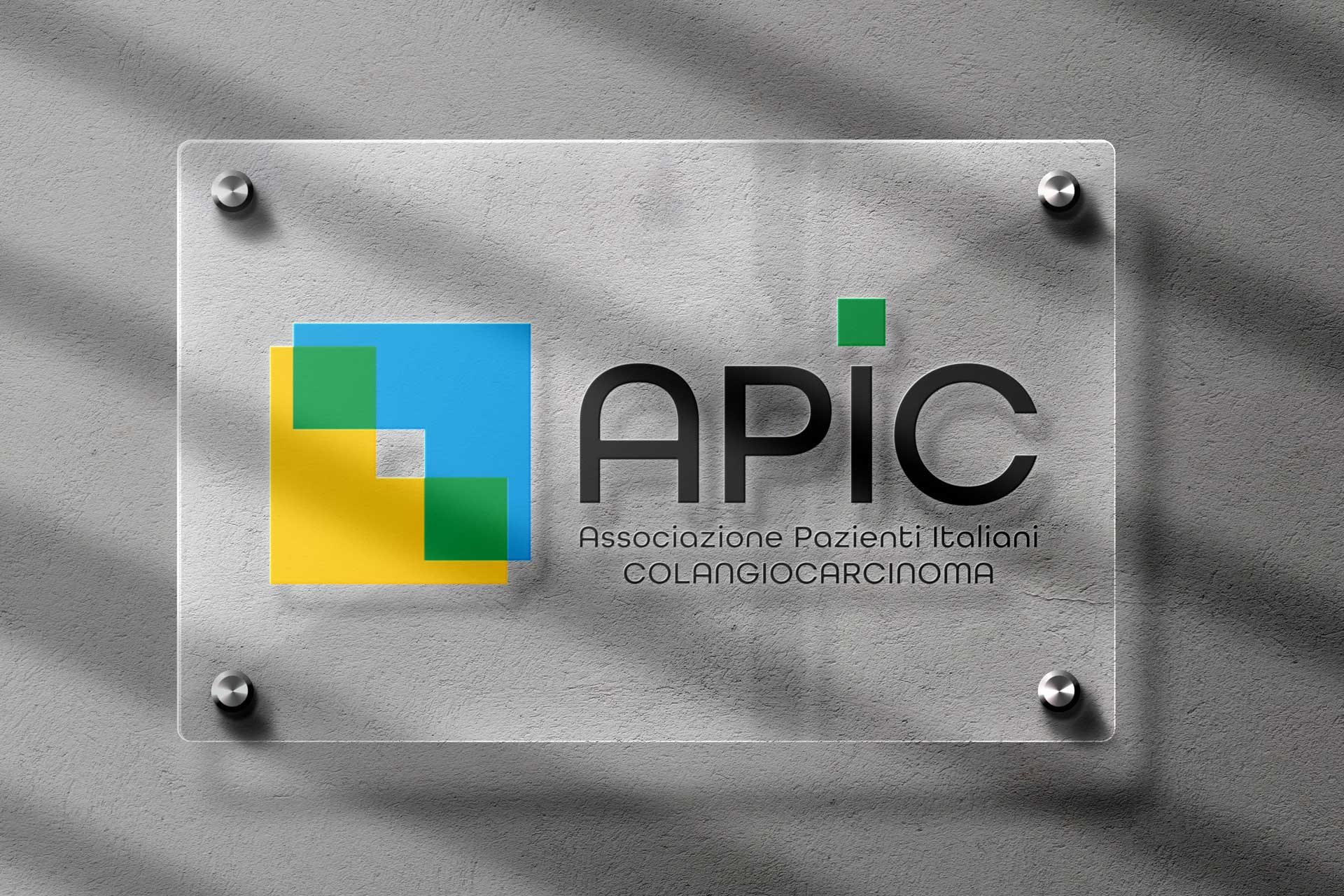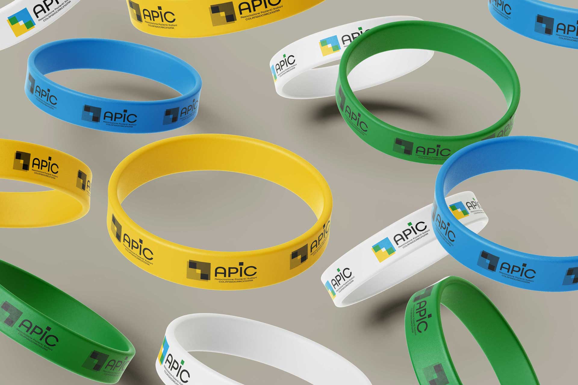
APIC
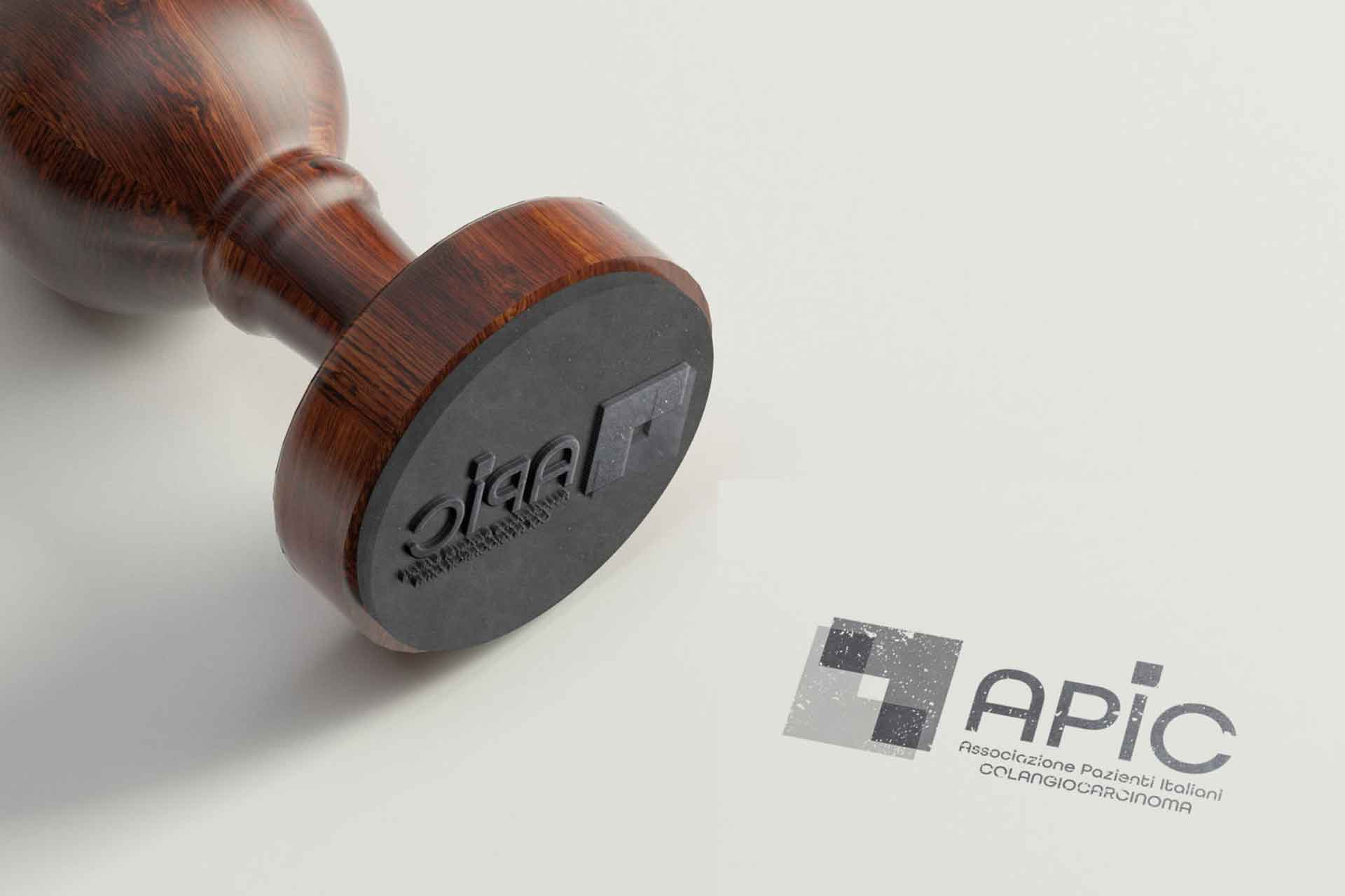
Redesign of the logo and corporate identity for APIC (Italian cholangiocarcinoma patient association). After an in-depth brief, the context, objectives and uniqueness of Apic were identified. The association aims to act as a bridge between patients, doctors and care givers by disseminating information on prevention and treatment but also by assisting patients and their families. A symbol was created that represents how the focus of each initiative puts the patient at the center but also reflects many other concepts such as unity, hope, synergy and authority.
Even the colors indicate how the association is born from the will of distinct elements that come together around the patient.